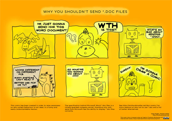
This is another project I started about two and a half years ago, but never got around to properly finish. The idea came about when encountering some of the annoying things which some people on the internet do: forwarding chain-mails or mailing *.doc files, for example.
It is oftentimes not that well taken when answering such mails with an — even friendly meant — explanation why such a behavior is annoying. So the idea of drawing a comic which explains the issue in a brief and funny way came about. Everybody likes comic strips, right?
So instead of replying such *.doc mails with a textual explanation it would be more practical (and probably the sender would take it better) to link a comic strip.
At the time I talked to Kate and she made some sketches for such a strip which I then proceeded to scan. I never got around to digitize them properly and build an illustration from them. But I have done so now:

(click on image or here to enlarge)
The illustration has been created in DIN A1, click here to get the large (114 MB) PDF. The raw photoshop file is available here (58 MB) as well. If you want to mail the link to someone you could use this one:
http://micha.elmueller.net/doc-comic/comic.png (1280x904px, 515 KB)All files are licensed under a Creative Commons Attribution 4.0 International license (CC-BY 4.0).
There are a lot of very well written texts explaining in detail why sending Microsoft Word *.doc files is not good practice. I like these two the best:
The original idea included creating a series from the comic. I’ll see if I get around to do that. If you have any ideas for fitting topics in such a series, please feel free to comment this post or mail me.
Valerie is currently presenting on the ongoing exhibition “Kunst oder Kitsch?” in Bad Schussenried (13. April – 22. June 2014). The idea was to let different artists (eighteen in total) explore where the separation between art and kitsch lies. What is still art and what is kitsch? Where does the line lie?
I liked the exhibition a lot! The topic is really interesting and made me curious immediately. Some artists made artworks which run really hard on the borderline between art and kitsch and it is a lot of fun walking through the exhibition and discussing about specific creations and their classifications.
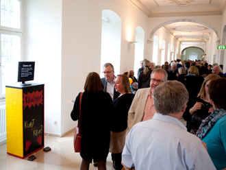
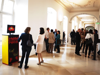
Some artists had the idea to complete the exhibition with a — not that seriously meant — interactive installation where visitors have the possibility to rate the exhibition: does it rather present kitsch or art? They asked me if I would like to build such a thingy. I started with the software and after a while Leo joined and developed the electronic hardware part: two large footswitches need to be pressed in order to vote. Valerie also greatly helped in building the funfair-like wooden base for the “Kitschometer”.
It basically works like this: you press one of the buttons to vote if the exhibition rather presents art or kitsch in your opinion. A random, fancy song will then be played and a tachometer will hit out on either art or kitsch, depending on how the previous voters have rated. The exhibition runs for three months and I think it’s a nice gimmick.
The code and technical documentation is up on GitHub. The installation could surely have been build technically more elegant, but in this case a pragmatic approach was taken due to time constraints. The footswitches are borrowed from the workshop at the University Ulm. This is exactly how a university should be! It should enable people to just do stuff and not constrain them in realizing ideas!
I would definitely like to create more installations.
Update:
The exhibition ran for about three months, about 3.800 visitors attended. The final score of the installation was: art – 882, kitsch – 772.


