MICHA.ELMUELLER


GTFS Visualizations

GTFS is an abbreviation for General Transit Feed Specification, a standard which “defines a common format for public transportation schedules and associated geographic information”. Basically this is a possibility for public transport agencies — like the Stadtwerke Ulm/Neu-Ulm (SWU) for example — to release their data to the public in a proper manner. Fortunately some agencies have done so (here’s a list). In Germany the agencies in Ulm and Berlin have released their schedule data under a free license as GTFS. In both cases this process was pushed forward by local Open Data enthusiasts who were involved in this process. Together with some friends from the UlmAPI group, I was involved within the efforts here in Ulm and it has since tempted me to create something from this data.

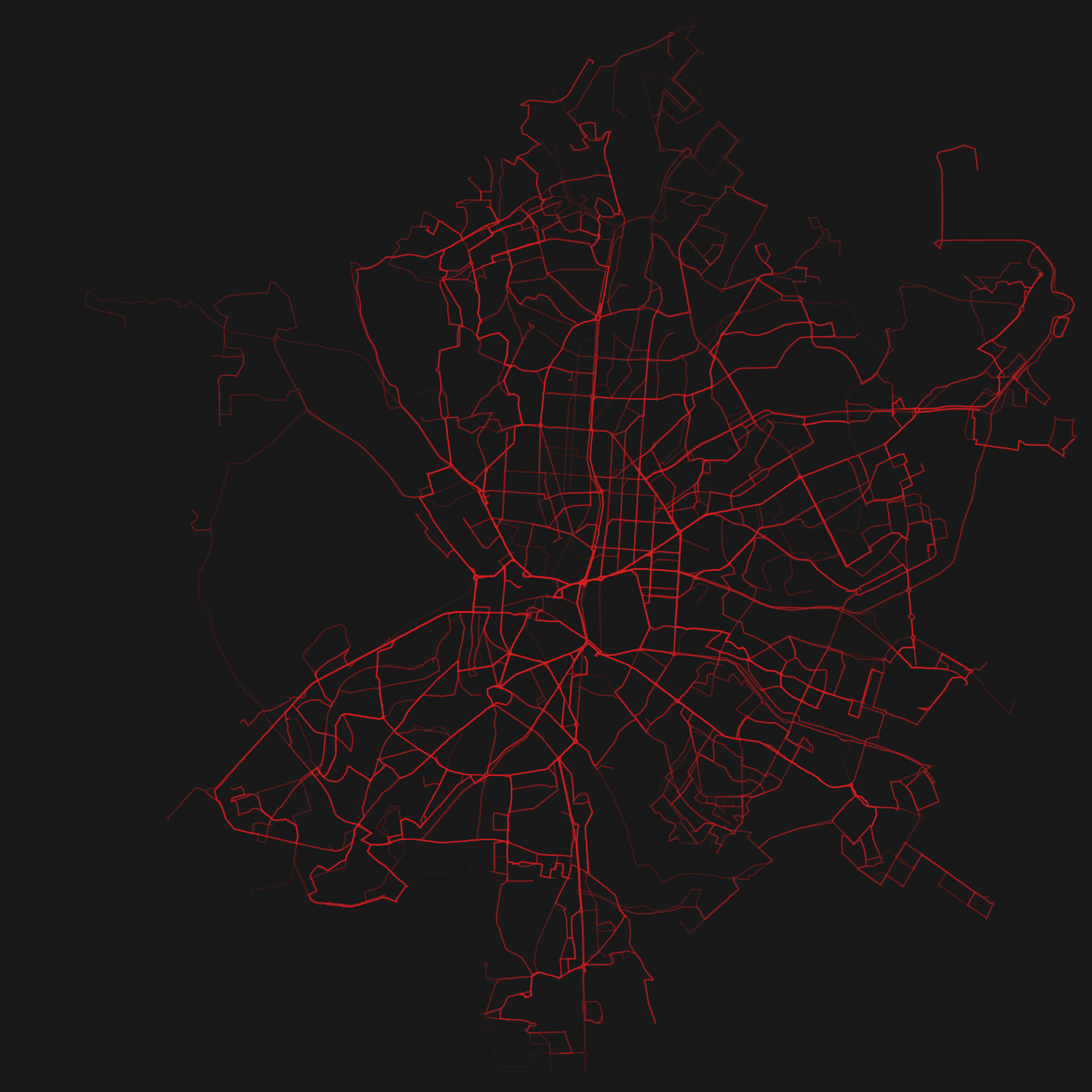
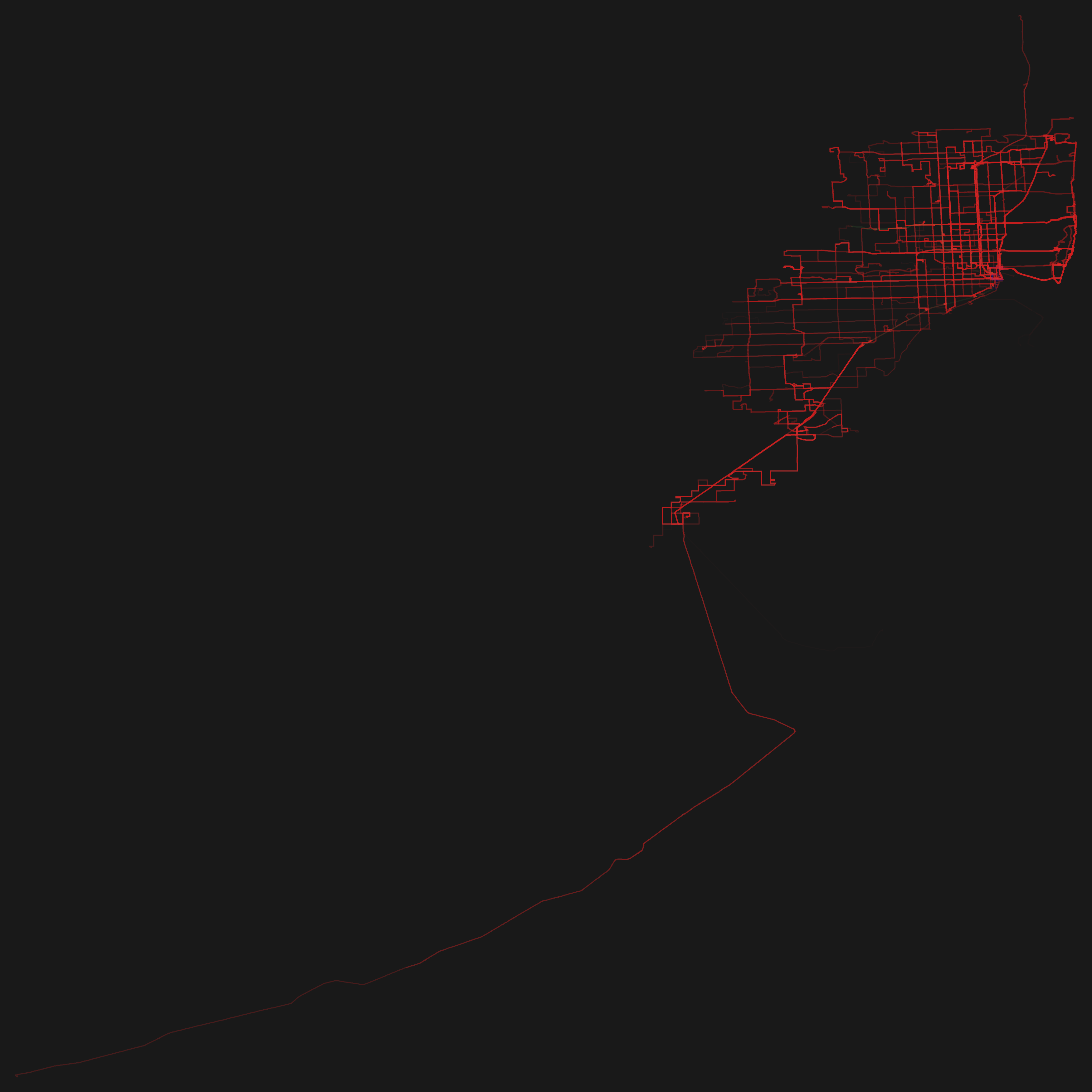
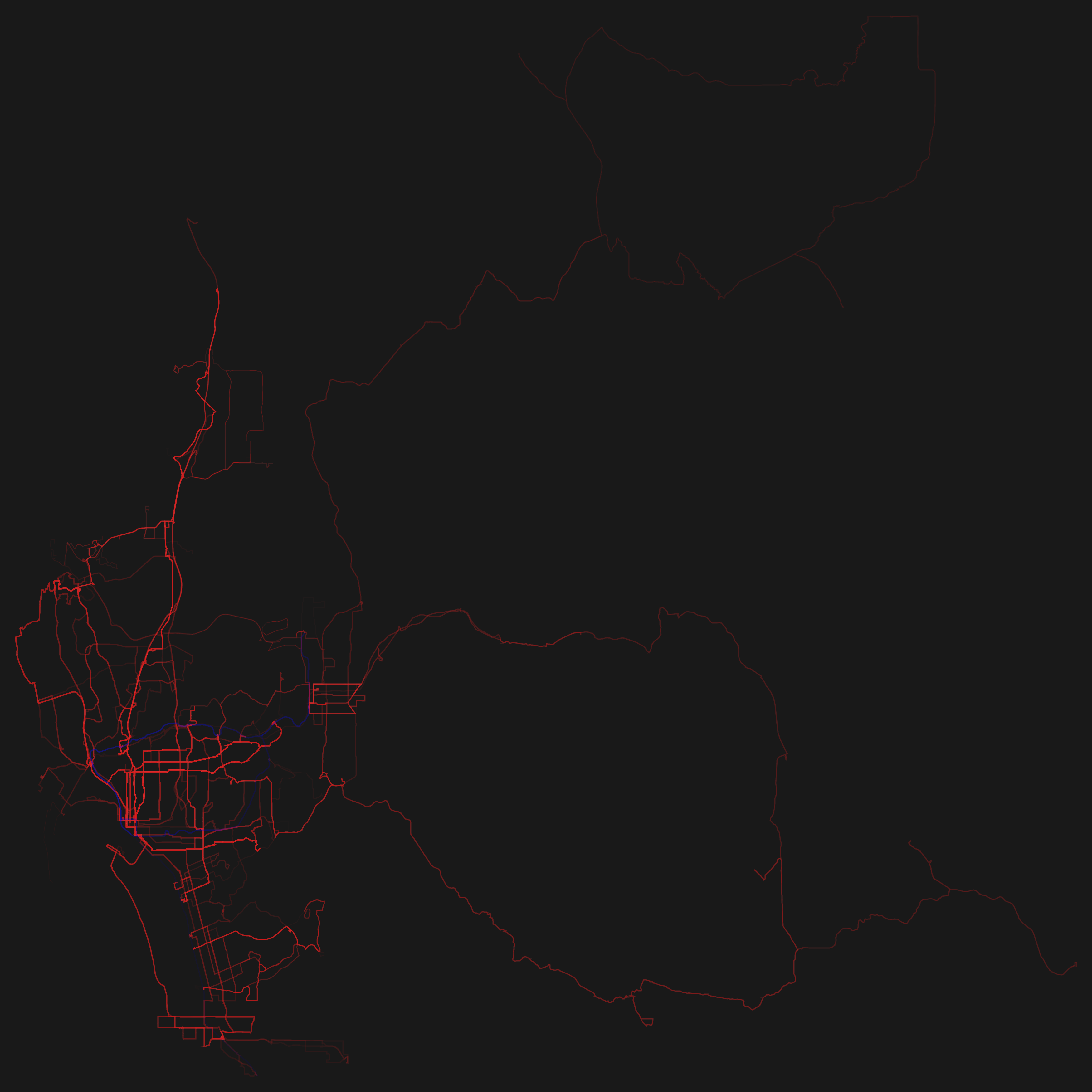
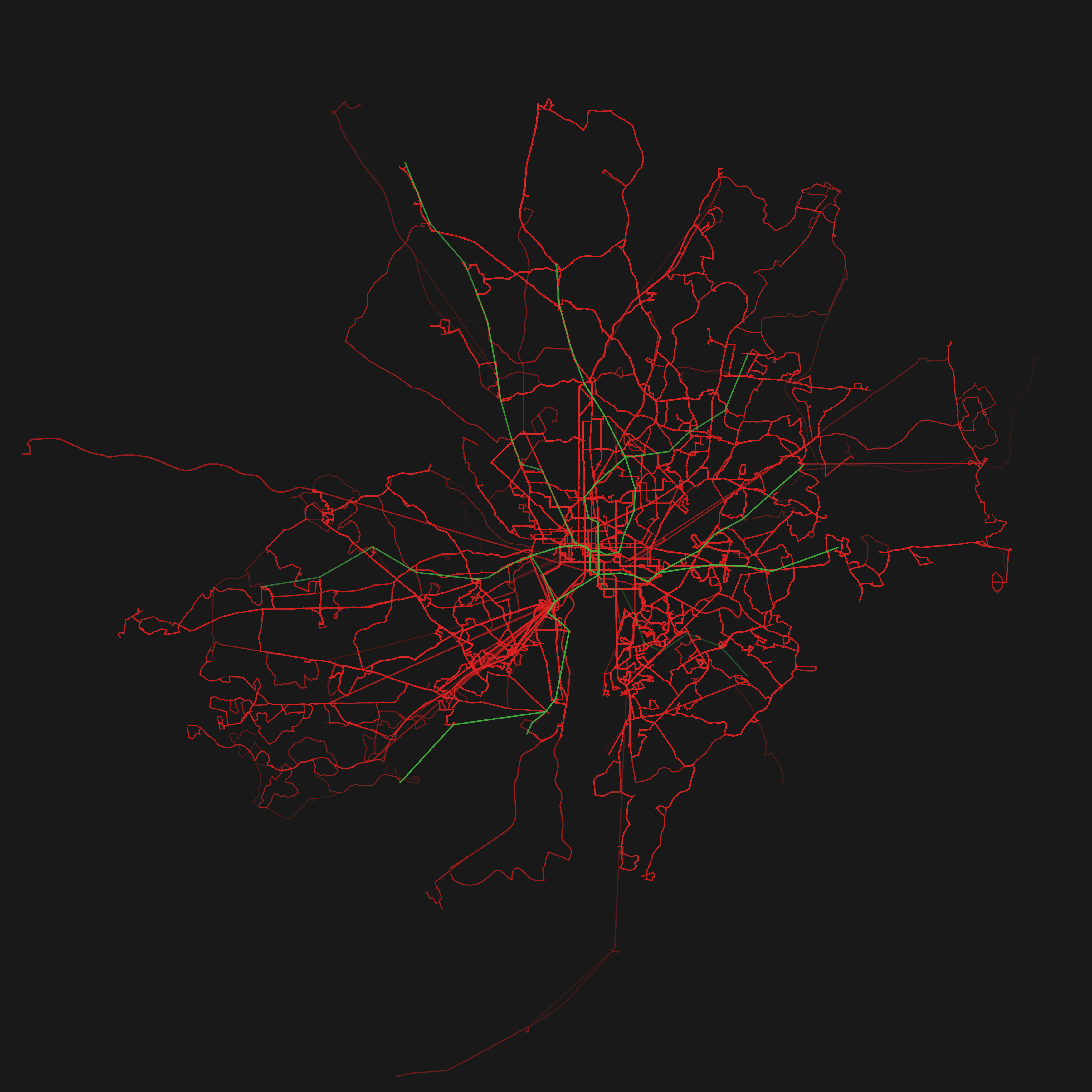
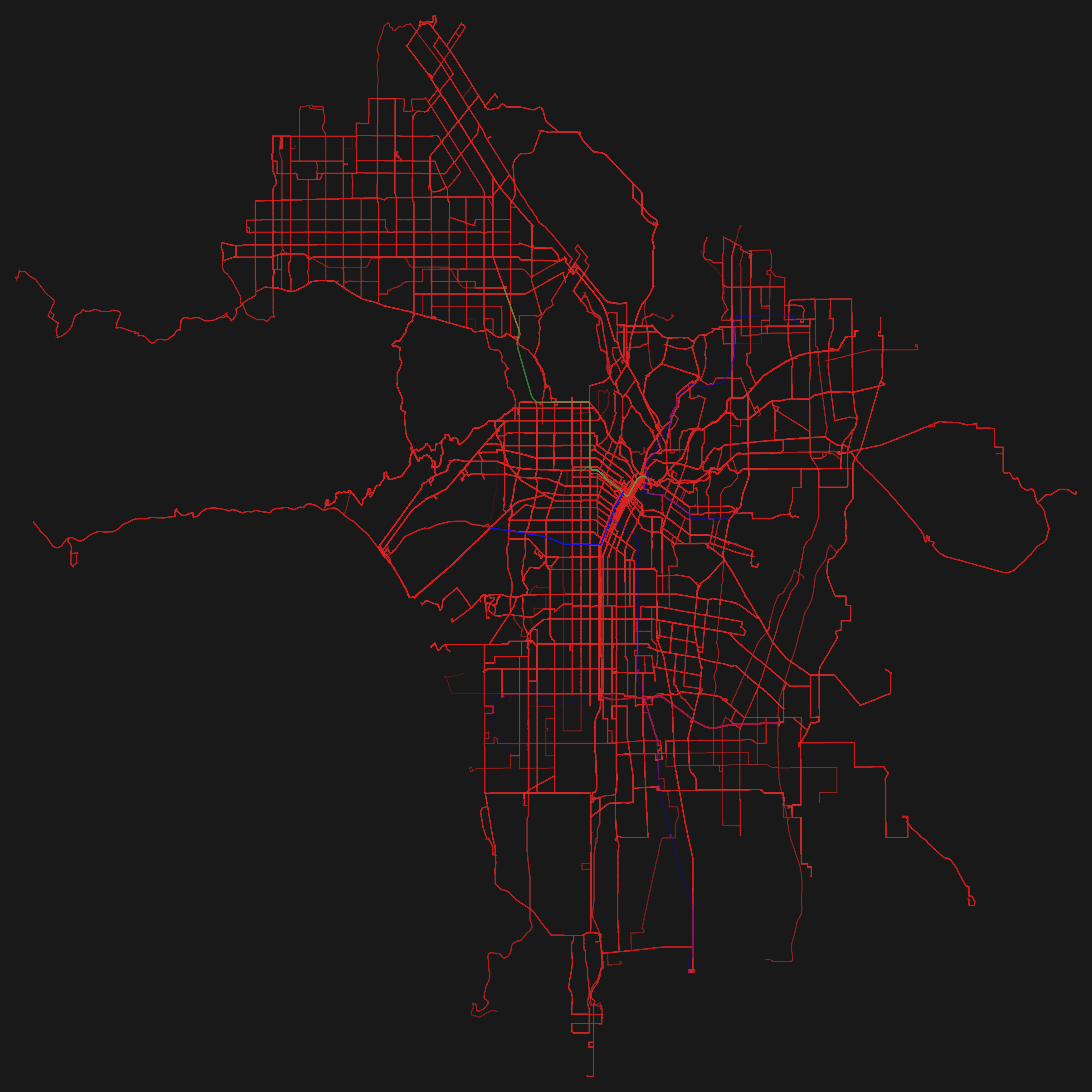
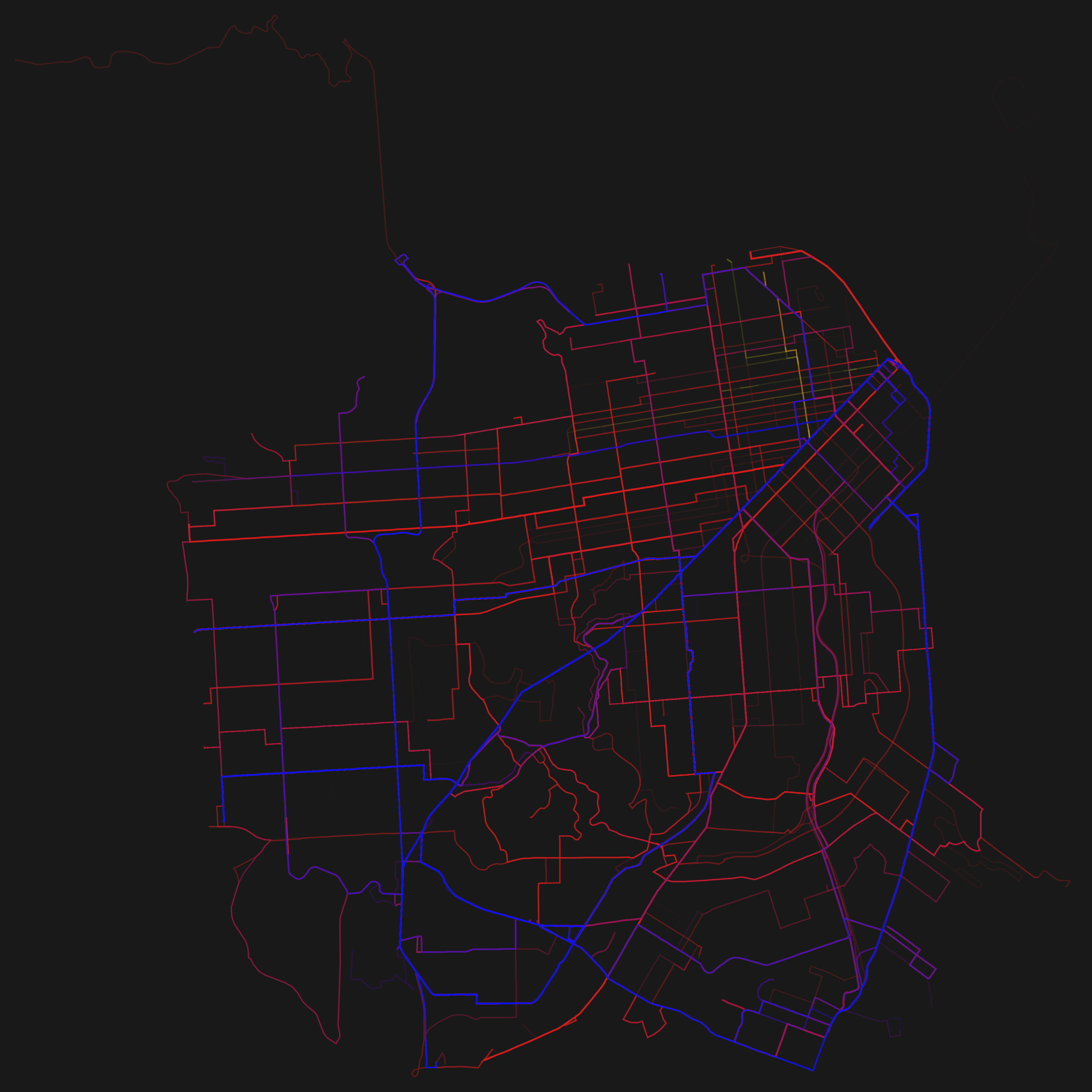
So basically I wrote a program which visualizes GTFS. The program draws the routes which transportation entities take and emphasizes the ones which are frequented more often by painting them thicker and in a stronger opacity. Since many agencies have released their schedule as GTFS it is easily possible to reuse the program as a mean to visualize different transportation systems in different cities.

So here are the renderings for some GTFS feeds! Just click on the thumbnails to get a larger image. The color coding is: red=busses, green=subway/metro, blue=tram.


Madrid
GTFS data: Empresa Municipal de Transportes.
Download: PNG (1.4 MB) | PDF (0.4 MB)

Miami
GTFS data: Miami Dade Transit.
Download: PNG (0.3 MB) | PDF (0.8 MB)
 

San Diego
GTFS data: San Diego Metropolitan Transit System.
Download: PNG (0.5 MB) | PDF (0.6 MB)

Ulm
GTFS data: Stadtwerke Ulm/Neu-Ulm.
Download: PNG (0.4 MB) | PDF (0.12 MB)
 

Washington DC
GTFS data: DC Circulator & MET.
Download: PNG (1.2 MB)

Los Angeles
GTFS data: Metro Los Angeles.
Download: PNG (0.9 MB)
 

San Francisco
GTFS data: San Francisco Transportation Agency.
Download: PNG (1 MB) | PDF (1.1 MB)
 

I am very satisfied with the resulting images, which in my opinion look really beautiful. I have rendered some of the cities as PDFs as well. With the momentary program, this is a very time consuming process and for some cities — due to performance or memory issues — not even possible on my (quite sophisticated) pc. This is due to the enormous transportation schedule (> 300 MB, ASCII) of some cities. But my program can surely be heavily optimized.

Please note: These visualizations would not exist without Open Data. This project was only possible because of transport agencies releasing their data under a free license. One should not forget that the existence of projects like this is a major benefit of Open Data.

Also one should not forget that standardized formats in the Open Data scene have proven to be a major benefit. Existing applications can easily be re-deployed like in the case of Mapnificent, OpenSpending or, well, in mine.

The best thing to do with your data will be thought of by someone else.

License & Code
The images are licensed under a Creative Commons Attribution 4.0 International license (CC-BY 4.0). Feel free to print, remix and use them! The source code is available via GitHub under the MIT license. Please note that it definitely has to be properly refactored since it wasn’t designed, but rather grew. That’s also the reason for using two different technologies (node.js and processing) within the project. I had a different thing in mind when I started coding.

Preventing misunderstandings
To prevent misunderstandings: The visualizations show only the data released by the according agencies! So in the case of e.g. Madrid there exists a metro line which is not shown in the visualization above. This is due to a different agency — who has not yet released their data as GTFS — operating the metro line. I hope that more agencies start to make their data freely available after seeing which unexpected and beautiful results they might get.

Another misunderstanding which I want to directly address: The exact GTFS feed is visualized. This means that when looking closely at the resulting PDF you may find some lines which are very close to another and might even overlap in part. This is no bug, but the way the shapes are defined in the feed.

Printing
If you want to print the visualizations: I have created two posters (DIN A0). The graphics within them are properly generated PDFs in CMYK. So be aware that the colors will look different on your screen than when printed.


(click on image to enlarge)

Madrid (PDF, 11 MB)


(click on image to enlarge)

Madrid, Ulm, Washington, San Diego (PDF, 81 MB)


“Scratches”

During autumn last year I had the chance to work as an assistant within a research project at university. The idea was to conduct a study on broken smartphone displays: how often do displays break? Where do they break most often? How does this affect the interaction of users with the phone and—most interestingly—what coping strategies have users developed in order to handle those limitations of the display?

I am quite proud to say that the results have been published as an academic paper at the CHI conference: “Broken Display = Broken Interface? The Impact of Display Damage on Smartphone Interaction.“—yay!

As part of the study we asked people to send us photos of their smartphones with broken displays. There were certain criteria which one had to follow in order to send us an acceptable photo—e.g. a green/white checkerboard image had to be displayed in full screen.


The first image shows the processed version of a submitted photo. It has been prepared using various techniques (cropping, white-balance, perspective alignment, etc.). The second and third photo show the manual annotations which we did as preparations to further analyze the photos.
 

A part of my work on the project focused on analyzing these photos. I used Matlab and the imagemagick suite to automate a part of this process (Unix style!). One late night, I was working on developing a “contiguous-area-search” algorithm. In order to better retrace if this process was correctly working I started rendering images with the resulting contiguous areas. I was quite surprised to see how interesting this looked and before I knew it I was diving into this. The hours went by and I kept working on improving the algorithm and the color scheme. Eventually I got to the results below, which in my opinion look really interesting. To further process them in an artistic manner I made a selection of twelve of these photos (there are about a hundred of them in total), vectorized them and scaled them to common proportions:

 
This is a selection of twelve photos from the complete set.
I have uploaded the according SVGs here: scratches on GitHub (CC-BY 4.0 International).
 

From my perspective the relation of science and art is really interesting and I aim to explore this space more. The way in which I see it, art and science depend heavily on each other. Art inspires and encourages to dream. Just think about the way in which e.g. Jules Verne or Isaac Asimov have influenced science.
On the other hand, science influences art by providing new insights and findings. Take the enormous area of art inspired by psychedelic substances for example. None of this would exist without the findings of scientists. Science provides new instruments and tools as means to create art. We have come a long way since caveman paintings: modern artistic expression has many forms, be it photography or e.g. electronic music.

The artistic process I used in order to create the images above is called Generative Design. It clearly separates from the way by which traditional artists operate. From caveman paintings to the modern process of creating illustrations (Photoshop and a cursor) there wasn’t as much change as one might think: it still breaks down to the same basic principles.

Generative Design is an entirely different process. The artist creates an algorithm which renders the results. But he doesn’t define specific images, drawings, shapes or colors. All of this is generated by the algorithm. This is an entirely different approach and we get some advantages which a “normal” artistic process does not posses. E.g. we get the possibilities of using the calculation power of a computer to create things which are not possible for a human (or at least only possible under the investment of a lot of energy). Examples of this are e.g. enormously complex forms or shapes which can be generated using a generative design process.

In my case the algorithm has been used to automatically process about a hundred of those photos. After seeing the results I adapted the algorithm as a mean to further influence the results. This is a typical generative design workflow: developing an algorithm, analyzing the results and iteratively adapting the algorithm.

I would love to present these generative works on an exhibition, gallery or something similar. If you are aware of any possibilities where this could be a fitting content I would very much appreciate to hear from you.

I really like the title Scratches for these artworks, Pasi deserves recognition for coming up with it.

Visualizing WikiLeaks Mirrors

After WikiLeaks released the diplomatic cables on 28. November 2010, several DNS services refused to resolve the domains. In the days and weeks after this incident about 2.200 mirror sites were set up by volunteers. This event shows how the decentralized structure of the internet was used to prevent censorship and depression.

The video shows a visualization of the wikileaks mirrors.

Finding all domains for the mirrors was not a problem, there are several sites listing adresses on a simple HTML page. This list can easily be parsed (for that task I used node.js). For resolving these domains to a WGS84 coordinate I used the same free GeoIP database as in the traceroute project. For more details on resolving domains to coordinates and mapping them on a globe see my last blog post (visualizing traceroute).

It is pretty interesting that the servers in fact are distributed over the whole world. Most of them are located — not really surprisingly — in Central Europe. But there are also some mirrors in China. Of course these results give no 100% exact location, but I think a tendency is clearly visible.

I’ve put together a little video of the global mirror distribution:

directlink to vimeo

Visualizing traceroute

Notice: This article was originally published on the blog ioexception.de (in german).

To get more familiar with Processing and OpenGL I wrote a graphical frontend for the Unix progarm traceroute. The output of traceroute is a list of stations a packet takes on it’s way through the network. This way network connection can easily be debugged, for example.

Technically this is realized with a “Time-To-Live”-field in the header of IP-packets. The TTL-entry describes after how many stations a packet should be discarded. Each router, which the packet passes, decrements this field. Once the TTL reaches 0 the packet is discarded and the sender gets notified with the ICMP-message TIME_EXCEEDED.

traceroute makes use of this and repeatedly sends packets to the destination host. The TTL gets incremented with each packet until the destination host is reached. The hosts on the route will give notice via ICMP-message. This way we will gather informations about the hosts and hopefully be able to identify the individual hosts on the route. The route may not be correct inevitably. There are several reasons for possible variations, e.g. firewalls often completely disable ICMP.

For the visualization I have tied traceroute to Processing. For further explanations on how to this see my blog post at ioexception.de. Though the post is in german the code will make things clear. It’s not really a complicated to do. The frontend reads the output of the command traceroute domain.org until EOF. Each line gets parsed and each individual host is resolved to an IP-address. Then a coordinate for this IP is assigned.

The coordinates can then — with some sin/cos magic — be mapped on a globe. Resolving IPs to a Geolocation is realized using a GeoIP database. GeoIP databases assign a coordinate for an IP with a certain probability and are not specifically 100% exact. But for our purpose this will do. There are some free suppliers and many commerical ones. I decided to give the free GeoLite City by Maxmind a go. This way we can resolve IP adresses to a WGS84 coordinate.

For the fronted I wrote a visualization in Java using the Processing API. The texture of the globe gets furthered rendered using a shader written in GLSL. Libraries I used: GLGraphics (OpenGL Rendering Engine for Processing), controlP5 (Button, Slider, Textfield) and toxiclibs (Interpolation & more numerical methods).

The source code is available under MIT on GitHub: visual-traceroute.

Some eye candy can be found within this video:

vimeo directlink.

About Me

I am a 32 year old techno-creative enthusiast who lives and works in Berlin. In a previous life I studied computer science (more specifically Media Informatics) at the Ulm University in Germany.

I care about exploring ideas and developing new things. I like creating great stuff that I am passionate about.

License

All content is licensed under CC-BY 4.0 International (if not explicitly noted otherwise).
 
I would be happy to hear if my work gets used! Just drop me a mail.
 
The CC license above applies to all content on this site created by me. It does not apply to linked and sourced material.
 
http://www.mymailproject.de