MICHA.ELMUELLER


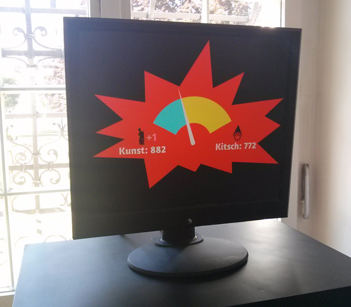
Exploring the ZEIT ONLINE API

The german weekly newspaper “DIE ZEIT” has an API available. This means it is easily possible for developers to use a lot of their data. Since they have made access to the data of nearly 400.000 articles since 1945 possible this is quite interesting (access to full texts is sadly missing, but a lot of other stuff is available). This post is about some of the interesting things I found whilst exploring the API.

My initial idea was to visualize how the ratio of articles with anglicisms evolved over time. At the moment this is too complex a project, due to the fact that getting the necessary data via the current API is difficult. However, I made some other interesting findings along the way.

The Wiktionary project provides a list of anglicisms (around 960 words) which I parsed out and used to search for articles concerning these words. This gave a list of how many matching articles on this word had been written each year since 1945. I also made an empty search to find out how many articles were created in total each year. These numbers could then be used to calculate the percentage of articles with anglicisms in each year.

Not all of the words provided interesting results but here is selection of some interesting ones. Please be aware that the statistics show a zoomed-in range. This is not a scale of 0-100%!

One should be very careful to interpret reasons for the peak just by looking at the visual representation. A potential reason might be the Gulf War in 1990–91 (the german translation is: “Golfkrieg”). Other causes worth investigating could be successes of german golf athletes or events around the VW Golf automobile.

Potential reasons for the peaks could be: in 1985 the Sinking of the Rainbow Warrior, in 1995 the Brent Spar protests and in 2010 the Deepwater Horizon.

The peak in 1987 could relate to the increased media coverage on aids. Also in 1987 the Institute for German Language (Gesellschaft für deutsche Sprache) chose “aids” has as the word of the year.

The peak in 1970 is most interesting to me, a potential cause could be the movement of 1968.

I have made the code used to gather the data and build the visualizations available under the MIT license via GitHub.

GTFS Visualizations

GTFS is an abbreviation for General Transit Feed Specification, a standard which “defines a common format for public transportation schedules and associated geographic information”. Basically this is a possibility for public transport agencies — like the Stadtwerke Ulm/Neu-Ulm (SWU) for example — to release their data to the public in a proper manner. Fortunately some agencies have done so (here’s a list). In Germany the agencies in Ulm and Berlin have released their schedule data under a free license as GTFS. In both cases this process was pushed forward by local Open Data enthusiasts who were involved in this process. Together with some friends from the UlmAPI group, I was involved within the efforts here in Ulm and it has since tempted me to create something from this data.

So basically I wrote a program which visualizes GTFS. The program draws the routes which transportation entities take and emphasizes the ones which are frequented more often by painting them thicker and in a stronger opacity. Since many agencies have released their schedule as GTFS it is easily possible to reuse the program as a mean to visualize different transportation systems in different cities.

So here are the renderings for some GTFS feeds! Just click on the thumbnails to get a larger image. The color coding is: red=busses, green=subway/metro, blue=tram.


Madrid
GTFS data: Empresa Municipal de Transportes.
Download: PNG (1.4 MB) | PDF (0.4 MB)

Miami
GTFS data: Miami Dade Transit.
Download: PNG (0.3 MB) | PDF (0.8 MB)
 

San Diego
GTFS data: San Diego Metropolitan Transit System.
Download: PNG (0.5 MB) | PDF (0.6 MB)

Ulm
GTFS data: Stadtwerke Ulm/Neu-Ulm.
Download: PNG (0.4 MB) | PDF (0.12 MB)
 

Washington DC
GTFS data: DC Circulator & MET.
Download: PNG (1.2 MB)

Los Angeles
GTFS data: Metro Los Angeles.
Download: PNG (0.9 MB)
 

San Francisco
GTFS data: San Francisco Transportation Agency.
Download: PNG (1 MB) | PDF (1.1 MB)
 

I am very satisfied with the resulting images, which in my opinion look really beautiful. I have rendered some of the cities as PDFs as well. With the momentary program, this is a very time consuming process and for some cities — due to performance or memory issues — not even possible on my (quite sophisticated) pc. This is due to the enormous transportation schedule (> 300 MB, ASCII) of some cities. But my program can surely be heavily optimized.

Please note: These visualizations would not exist without Open Data. This project was only possible because of transport agencies releasing their data under a free license. One should not forget that the existence of projects like this is a major benefit of Open Data.

Also one should not forget that standardized formats in the Open Data scene have proven to be a major benefit. Existing applications can easily be re-deployed like in the case of Mapnificent, OpenSpending or, well, in mine.

The best thing to do with your data will be thought of by someone else.

License & Code
The images are licensed under a Creative Commons Attribution 4.0 International license (CC-BY 4.0). Feel free to print, remix and use them! The source code is available via GitHub under the MIT license. Please note that it definitely has to be properly refactored since it wasn’t designed, but rather grew. That’s also the reason for using two different technologies (node.js and processing) within the project. I had a different thing in mind when I started coding.

Preventing misunderstandings
To prevent misunderstandings: The visualizations show only the data released by the according agencies! So in the case of e.g. Madrid there exists a metro line which is not shown in the visualization above. This is due to a different agency — who has not yet released their data as GTFS — operating the metro line. I hope that more agencies start to make their data freely available after seeing which unexpected and beautiful results they might get.

Another misunderstanding which I want to directly address: The exact GTFS feed is visualized. This means that when looking closely at the resulting PDF you may find some lines which are very close to another and might even overlap in part. This is no bug, but the way the shapes are defined in the feed.

Printing
If you want to print the visualizations: I have created two posters (DIN A0). The graphics within them are properly generated PDFs in CMYK. So be aware that the colors will look different on your screen than when printed.


(click on image to enlarge)

Madrid (PDF, 11 MB)


(click on image to enlarge)

Madrid, Ulm, Washington, San Diego (PDF, 81 MB)


Interactive Installation: “Kunst oder Kitsch?”


Valerie is currently presenting on the ongoing exhibition “Kunst oder Kitsch?” in Bad Schussenried (13. April – 22. June 2014). The idea was to let different artists (eighteen in total) explore where the separation between art and kitsch lies. What is still art and what is kitsch? Where does the line lie?

I liked the exhibition a lot! The topic is really interesting and made me curious immediately. Some artists made artworks which run really hard on the borderline between art and kitsch and it is a lot of fun walking through the exhibition and discussing about specific creations and their classifications.

Some artists had the idea to complete the exhibition with a — not that seriously meant — interactive installation where visitors have the possibility to rate the exhibition: does it rather present kitsch or art? They asked me if I would like to build such a thingy. I started with the software and after a while Leo joined and developed the electronic hardware part: two large footswitches need to be pressed in order to vote. Valerie also greatly helped in building the funfair-like wooden base for the “Kitschometer”.

It basically works like this: you press one of the buttons to vote if the exhibition rather presents art or kitsch in your opinion. A random, fancy song will then be played and a tachometer will hit out on either art or kitsch, depending on how the previous voters have rated. The exhibition runs for three months and I think it’s a nice gimmick.

The code and technical documentation is up on GitHub. The installation could surely have been build technically more elegant, but in this case a pragmatic approach was taken due to time constraints. The footswitches are borrowed from the workshop at the University Ulm. This is exactly how a university should be! It should enable people to just do stuff and not constrain them in realizing ideas!

I would definitely like to create more installations.


Update:
The exhibition ran for about three months, about 3.800 visitors attended. The final score of the installation was: art – 882, kitsch – 772.


Wrote a Twitterwall

I have written a simple Twitterwall — a website which tracks tweets for a certain term. You can leave the website open and it will constantly show new tweets on the term you defined. This has proven to be quite a nice feature for events like BarCamps or other conferences. Setting up a beamer and displaying the Twitterwall in fullscreen is quite a nice feature for visitors who want to get a feeling for the conference mood or check on news.

Credit for the extrinisic motivation goes to Falco, who used the wall at the DEM 2013 and threatened to fork the project, if I wasn’t working on it. He also submitted a pull request for quite a nasty little bug. Last weekend we also used the wall at the OpenCityCamp. This brought up some issues, but I think I eventually figured them all out. The future will hold the answers.

However, the project is still in an early stage and quite simple in its functionalities. So far there is no possibility to track users/locations or show images, though I plan to add this over time. I have released the project under a free license on GitHub and as a package via npm (npm install twitterwall).

You can easily set up your own instance (further details in the readme) or you can use the public instance I have set up on http://twitterwall.creal.de.

About Me

I am a 32 year old techno-creative enthusiast who lives and works in Berlin. In a previous life I studied computer science (more specifically Media Informatics) at the Ulm University in Germany.

I care about exploring ideas and developing new things. I like creating great stuff that I am passionate about.

License

All content is licensed under CC-BY 4.0 International (if not explicitly noted otherwise).
 
I would be happy to hear if my work gets used! Just drop me a mail.
 
The CC license above applies to all content on this site created by me. It does not apply to linked and sourced material.
 
http://www.mymailproject.de