MICHA.ELMUELLER


Interactive Installation: “Kunst oder Kitsch?”


Valerie is currently presenting on the ongoing exhibition “Kunst oder Kitsch?” in Bad Schussenried (13. April – 22. June 2014). The idea was to let different artists (eighteen in total) explore where the separation between art and kitsch lies. What is still art and what is kitsch? Where does the line lie?

I liked the exhibition a lot! The topic is really interesting and made me curious immediately. Some artists made artworks which run really hard on the borderline between art and kitsch and it is a lot of fun walking through the exhibition and discussing about specific creations and their classifications.

Some artists had the idea to complete the exhibition with a — not that seriously meant — interactive installation where visitors have the possibility to rate the exhibition: does it rather present kitsch or art? They asked me if I would like to build such a thingy. I started with the software and after a while Leo joined and developed the electronic hardware part: two large footswitches need to be pressed in order to vote. Valerie also greatly helped in building the funfair-like wooden base for the “Kitschometer”.

It basically works like this: you press one of the buttons to vote if the exhibition rather presents art or kitsch in your opinion. A random, fancy song will then be played and a tachometer will hit out on either art or kitsch, depending on how the previous voters have rated. The exhibition runs for three months and I think it’s a nice gimmick.

The code and technical documentation is up on GitHub. The installation could surely have been build technically more elegant, but in this case a pragmatic approach was taken due to time constraints. The footswitches are borrowed from the workshop at the University Ulm. This is exactly how a university should be! It should enable people to just do stuff and not constrain them in realizing ideas!

I would definitely like to create more installations.


Update:
The exhibition ran for about three months, about 3.800 visitors attended. The final score of the installation was: art – 882, kitsch – 772.


The Principles of Datalove — Audiomashup

Some years ago the Telecomix crew came up with the term datalove and wrote an according manifesto (see here for more details):

Love data
Data is essential
Data must flow
Data must be used
Data is neither good nor bad
There is no illegal data
Data is free
Data can not be owned
No man, machine or system shall interrupt the flow of data
Locking data is a crime against datanity
Love data

I use the term datalove quite often when referring to the free culture or open data movement. About two years ago I had the idea to create a voice mashup from the text and recorded various female friends reading the text. In order to give the mashup an electronic, digital feeling I alienated the voices a bit over an ambient electronic track (2012 by pielkor, CC-BY 3.0).

soundcloud direct link

At the time, two years ago, the result was not like I imagined and I wasn’t satisfied. So I didn’t release it online. Yesterday I listened to the track again and was quite surprised. It was by far not as bad as I recalled it. This angers me somehow. I have a lot of stuff, video interviews, photos, software, visualizations, which I haven’t released because I was unsatisfied with the quality, got aware of technical shortcomings whilst working on the project or realized how it could have been done better. In part, I am also trying to avoid giving other people a possibility to attack my own work. Today I think it was stupid not to release projects like this and I regret it. It was a nice project and I should let other people decide if they can use it or not.

I have to thank Saron, Zenib, Sonja, Kate, Amrei, Natty, Jenny, Elizabeth and Lisa without whom this mashup would not have been possible. The track is licensed under a Creative Commons 4.0 International Attribution license (CC-BY 4.0).

The student group I participate in is called datalove as well, ulmAPI is an open data project by the datalove group.

datalove

“Scratches”

During autumn last year I had the chance to work as an assistant within a research project at university. The idea was to conduct a study on broken smartphone displays: how often do displays break? Where do they break most often? How does this affect the interaction of users with the phone and—most interestingly—what coping strategies have users developed in order to handle those limitations of the display?

I am quite proud to say that the results have been published as an academic paper at the CHI conference: “Broken Display = Broken Interface? The Impact of Display Damage on Smartphone Interaction.“—yay!

As part of the study we asked people to send us photos of their smartphones with broken displays. There were certain criteria which one had to follow in order to send us an acceptable photo—e.g. a green/white checkerboard image had to be displayed in full screen.


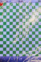
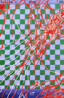
The first image shows the processed version of a submitted photo. It has been prepared using various techniques (cropping, white-balance, perspective alignment, etc.). The second and third photo show the manual annotations which we did as preparations to further analyze the photos.
 

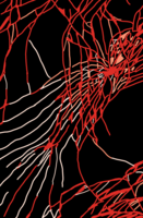
A part of my work on the project focused on analyzing these photos. I used Matlab and the imagemagick suite to automate a part of this process (Unix style!). One late night, I was working on developing a “contiguous-area-search” algorithm. In order to better retrace if this process was correctly working I started rendering images with the resulting contiguous areas. I was quite surprised to see how interesting this looked and before I knew it I was diving into this. The hours went by and I kept working on improving the algorithm and the color scheme. Eventually I got to the results below, which in my opinion look really interesting. To further process them in an artistic manner I made a selection of twelve of these photos (there are about a hundred of them in total), vectorized them and scaled them to common proportions:

 
This is a selection of twelve photos from the complete set.
I have uploaded the according SVGs here: scratches on GitHub (CC-BY 4.0 International).
 

From my perspective the relation of science and art is really interesting and I aim to explore this space more. The way in which I see it, art and science depend heavily on each other. Art inspires and encourages to dream. Just think about the way in which e.g. Jules Verne or Isaac Asimov have influenced science.
On the other hand, science influences art by providing new insights and findings. Take the enormous area of art inspired by psychedelic substances for example. None of this would exist without the findings of scientists. Science provides new instruments and tools as means to create art. We have come a long way since caveman paintings: modern artistic expression has many forms, be it photography or e.g. electronic music.

The artistic process I used in order to create the images above is called Generative Design. It clearly separates from the way by which traditional artists operate. From caveman paintings to the modern process of creating illustrations (Photoshop and a cursor) there wasn’t as much change as one might think: it still breaks down to the same basic principles.

Generative Design is an entirely different process. The artist creates an algorithm which renders the results. But he doesn’t define specific images, drawings, shapes or colors. All of this is generated by the algorithm. This is an entirely different approach and we get some advantages which a “normal” artistic process does not posses. E.g. we get the possibilities of using the calculation power of a computer to create things which are not possible for a human (or at least only possible under the investment of a lot of energy). Examples of this are e.g. enormously complex forms or shapes which can be generated using a generative design process.

In my case the algorithm has been used to automatically process about a hundred of those photos. After seeing the results I adapted the algorithm as a mean to further influence the results. This is a typical generative design workflow: developing an algorithm, analyzing the results and iteratively adapting the algorithm.

I would love to present these generative works on an exhibition, gallery or something similar. If you are aware of any possibilities where this could be a fitting content I would very much appreciate to hear from you.

I really like the title Scratches for these artworks, Pasi deserves recognition for coming up with it.

Prague


Been to Prague for a couple of days with some friends. What a beautiful city! Loved the nice house facades, the beer, food and discovering the history of the city. The trip was quite cheap and I think I should do that more often. A very nice feature of Europe is that we have so much culture on so little place. With today’s public transportation system it is so easy to go somewhere.

One should take more advantage of this. I have taken quite some inspiration from the trip and always find it enriching and encouraging to travel and educate ones view of the world.

We went by train, from Ulm-Prague and back to Ulm this cost about 77€. Take the train to Regensburg (Bayern-Ticket) and from there the “Prague Spezial” to Prague.

About Me

I am a 32 year old techno-creative enthusiast who lives and works in Berlin. In a previous life I studied computer science (more specifically Media Informatics) at the Ulm University in Germany.

I care about exploring ideas and developing new things. I like creating great stuff that I am passionate about.

License

All content is licensed under CC-BY 4.0 International (if not explicitly noted otherwise).
 
I would be happy to hear if my work gets used! Just drop me a mail.
 
The CC license above applies to all content on this site created by me. It does not apply to linked and sourced material.
 
http://www.mymailproject.de