Apr 30, 2013 1
The Aesthetics of Simplicity
Perfection is achieved, not when there is nothing more to add, but when there is nothing left to take away.
Simplicity is beautiful. Simplicity is pure. Simplicity is what we should aim for. Instead modern user interfaces, modern design, is overloaded. Creeping featurism: constantly adding features as a way to satisfy the need of any possible, thinkable customer that one might ever encounter. While searching for the perfect solution we eventually end up with a mess. We no longer have an interface that aims to solve a specific problem, but instead an interface that aims to solve everybody’s problems.
In a lot of ways this reminds me of the Unix philosophy, where basically the exact same problem is found within software engineering.
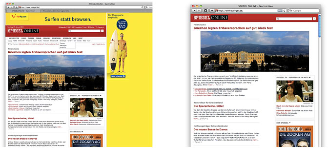
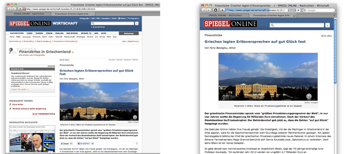
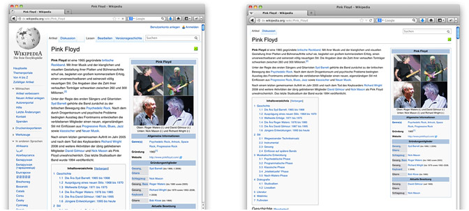
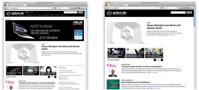
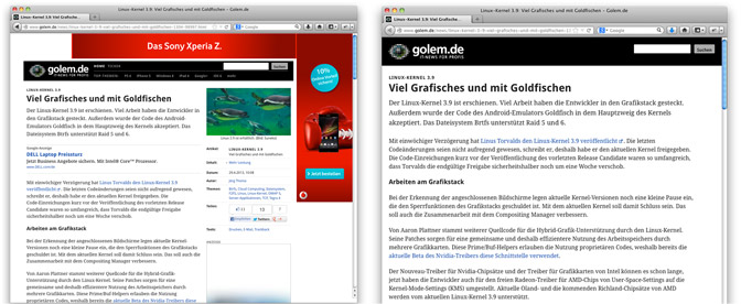
As an effort to improve the usability of some websites, which I often use, I started to build a loose collection of templates for the Privoxy web proxy. Basically the templates simplify the layout of the websites. I never add stuff. All I do is throw elements away.
To me, the interfaces look much more aesthetically pleasing and the websites are a lot easier to use. Unnecessary elements don’t take up all the space, don’t aim to catch the attention, don’t distract from what’s important. But make up your own opinion. On the left you see the unfiltered websites, on the right you see the websites after filtered through an AdBlock browser addon and the template collection.
I have published the project under a free license (MIT) to GitHub. Follow the Readme there to get stuff up and running. Please note: the project is in an early stage and each CSS change on the websites might affect the templates, thus you should not be surprised if some things might not look as expected. I plan to add various other sites to the project over time.
Update: I have created a tumblr where I will publish screenshots of the latest simplified websites: minimalistic-web.tumblr.com
