Mar 18, 2014 1
Reworking Typography
From time to time I find articles, texts or poems which I really like. But in some of those cases the text is typeset in such a poor way that it makes me sad. For me, typography has the same role as rhetoric—the way in which you say something can have a totally different impact and I think this is equally true for text and typography.
Sometimes I take time and make an effort to typeset the text in a better way. I have decided to publish some of these workings here from time to time. The first example is a poem by Kate, which was published in a collection last year. I love the poem and was quite saddened about the typesetting (on which she had no influence).
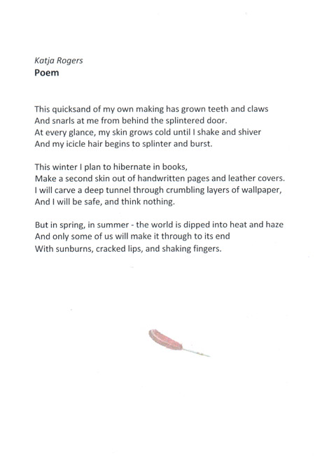
This is the published version:

And this is my reworked version:
In the published version the title of the poem was omitted and I don’t think the feather nor the font-face fit the text in any way. The photo quality of the feather really is as bad in the print as in the photo above. The font I used in the reworking is the Adobe Garamond Pro. The ornament is taken from the gorgeous Hoefler Text. If you are interested in the sourcecode of the newly set version (written in XeTeX): I have published it here. There you will also find the PDF version.

