Jan 31, 2015 0
Reworking Typography: The Last Question
The “Reworking Typography” series continues:
From time to time I find articles, texts or poems which I really like. But in some of those cases the text is typeset in such a poor way that it makes me sad. For me, typography has the same role as rhetoric—the way in which you say something can have a totally different impact and I think this is equally true for text and typography. Sometimes I take time and make an effort to typeset the text in a better way.
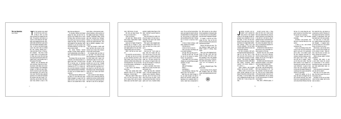
In the midst of 2014 I chose to newly typeset the fabulous short story “The Last Question” by Isaac Assimov. There are a lot of versions out there, but I haven’t been able to find a properly typeset one.
I chose to typset this specific story aſter I had read it and was thrilled by it. But sadly the typesetting of the document was horrible. However, it held a lot of potential: typesetting the computer speech or the different time zones for examples. I also liked the idea of using a grotesque font as a body text font, in order to support the futuristic manner of the story. I experimented with various layouts and fonts and at one point even had different, increasingly futuristic, fonts for the different time chapters. In the end, however, I decided to go for the less obtrusive approach.
I chose for a layout of DIN A5 with a two-column layout. I specifically chose the two-column layout, which I somehow associate with a more technical/scientific kind of text. The text was typeset using the PF Din Text Condensed. The computer output was set using OCR-A , a font which was designed as a mean to ease the transformation of printed text into a digital representation. For the ornaments I used the wonderful PTL Roletta Floral Ornaments font. The initials were typeset using two different fonts: the P22 Arts and Crafts and the Final Frontier font used in Star Trek. The titlepage was set using Gotham — a masculine, nearly monospaced, font designed by Tobias Frere-Jones for the GQ magazine. On the soſtware side this document was typeset using XeLaTeX. The (sadly very messy) sourcecode used to render the document is accessible via https://github.com/cmichi/reworking-typography.
The PDF is available here.
This is by far my favorite story of all those I have written.
After all, I undertook to tell several trillion years of human history in the space of a short story and I leave it to you as to how well I succeeded.
–Isaac Asimov on “The Last Question”


